In a world that paints itself as free and equal, the truth can sometimes be as stark as black and white—or Tiffany Blue, UPS Brown, and Barbie Pink. There’s something unsettling about a world where colours—those simple, ubiquitous elements of our visual landscape—are owned. The West, in its unabashed embrace of capitalism, has turned even the spectrum of visible light into a commodity. Here, colours are not just seen; they are owned, traded, and fiercely protected.
Trademarking the Rainbow
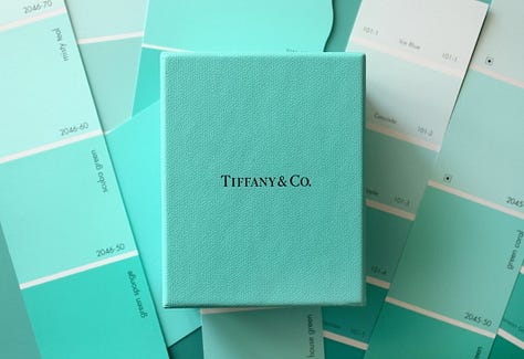
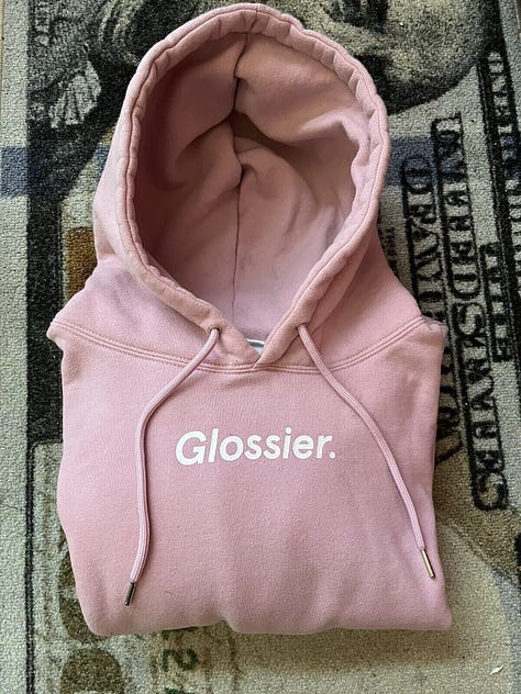
Take Tiffany & Co. They’ve trademarked a specific shade of blue (Pantone 1837), turning a piece of sky into a corporate asset, synonymous with luxury, wealth, and status. UPS has done the same with a particular brown. There’s also Glossier, the beauty brand that trademarked its soft millennial pink as part of its minimalist, “cool-girl” aesthetic. It’s a power move, right?


Controlling not just a brand identity but the way people see, feel, and interact with an entire colour. It’s more than just branding; it’s a statement—one that says, “We own this space. We own this feeling.”
But what does it say about us, as a society, that we’ve allowed corporations to own what we see? That we’ve let them carve out a slice of the rainbow and stamp their name on it? It feels like we’ve reached a point where even the abstract is up for sale. Like we’re slowly losing the ability to experience the world without it being mediated through some corporate lens. Pink isn’t just pink anymore – it’s Barbie (Pantone 219C). Red isn’t just red—it’s Coca-Cola (Pantone 484). Colours are no longer just colours; they’re brand identities, commodities in themselves.
They're battle flags of capitalism, planted in public spaces and private lives.
The legality of colour trademarking pivots on "secondary meaning", a legal criterion that demands a colour must evoke a specific commercial source in the mind of the consumer to qualify for trademark protection. This has allowed the West to build fortresses around hues that now signify far more than mere shades; but rather power, prestige - and exclusion.
The Western Palette
In the U.S. and Europe, where consumerism isn't just an economic activity but a cultural identity, colours serve as a subtle yet potent form of socio-economic gatekeeping. By trademarking colours, these corporations ensure that no one else in their sector can use the same shades, reinforcing their market dominance and keeping competition colourless.
The Cost of Colour
The stark difference in how colours are commodified in the West versus elsewhere, highlights a broader narrative of global inequality. It's not just that colours are trademarked; it's about what this signifies in terms of economic priorities and cultural values. In many parts of the Global South, colours can carry strong cultural, social, or religious significances that supersede commercial considerations (as they should) - affecting both the desire to trademark a colour and the perception of such actions. However, in the West, where capitalism is often unchecked and unchallenged, the colours we see are filtered through a lens of ownership and privilege.
In much of the Global South, where many communities fight for basic rights and recognition as a direct result of exploitative practices in the West, the battle for colour trademarking has often been relegated to the background. Economic strategies have focused more on functionality and affordability rather than differentiation through colour, where community-based and smaller-scale enterprises can play a more significant role.
Unfortunately, as we watch markets in these regions change and see a rise in large brands dominating global stages, varied cultural values are being erased. Instead, we are seeing an increase in attempts* at colour trademarking. Multinational companies now operating in these markets are influencing local practices, clashing with the rights of other businesses – particularly smaller enterprises.
Which begs the question, why corporations should have the right to own part of our visual spectrum, especially when it affects emerging businesses and especially, when it is used as a symbol of exclusion.
*I write ‘attempt’, because ultimately, colour trademarking is costly, laborious and complex. Whilst it is rare for a brand to successfully trademark a colour, there is a noticeable rise in those trying. This surge leans heavily into a system rigged in favour of the already powerful—a glaring echo of capitalism’s enduring rule. Trademark law increasingly serves corporate interests at the expense of smaller players – legal protections can be leveraged by well-resourced companies to maintain and extend their market power.
Closing Thoughts
It makes me uneasy, like the world is shrinking somehow. Like we’re being boxed into these pre-packaged experiences where everything is curated, controlled and owned. There’s no room for nuance when every shade comes with a price tag.
It’s as if we’re all wandering through this capitalist landscape, touching things we can never truly experience because someone else got there first.
It’s a reflection of how deeply entrenched corporate interests have become in our daily lives: dictating how we see the world, how we interpret beauty, and what we value – made all the more insidious because it’s so subtle and hidden behind corporate jargon such as ‘best marketing practices’.
There was a time when our senses were not bought and sold, when colours were just colours, when the sky was blue, and that was enough. When red was passion, anger, love—not the sole of a Louboutin shoe (Pantone 18-1663 TPX). Maybe there was a time when we could experience the world without everything being tied to consumption, and maybe there can be again.
For Interest: Some of the most famous trademarked colours
UPS Brown (Pantone 4625) - Associated with UPS delivery trucks and uniforms since 1916.
Tiffany Blue (Pantone 1837) - A bright robin’s egg blue, trademarked in 1998.
Barbie Pink (Pantone 219C) - A vibrant medium pink associated with Barbie products, used across a wide variety of merchandise categories. Mattel trademarked this pink for in the early 1990s.
T-Mobile Magenta (Pantone Process Magenta C) - A bright shade used in branding and successfully defended in court against similar uses by competitors.
Target Red (Pantone 186) - A bright red colour used extensively in Target’s branding and retail operations.
Cadbury Purple (Pantone 2685C) - Has been trademarked for chocolate wrappers since 1995 but faced numerous legal challenges in trademark disputes, with them actually losing exclusivity in 2013.
Coca-Cola Red (Pantone 484) - Perhaps one of the most instantly recognisable colours in the world, this red has been used by Coca-Cola since its inception in 1886.
Christian Louboutin Red (Pantone 18-1663 TPX) - Used on the soles of Louboutin shoes, successfully trademarked in various jurisdictions starting in 2008.
Starbucks Green (Pantone 3425C) - This green was trademarked in the 1980s and meant to evoke the rich, natural feel of its globally sourced coffees (lol).
Glossier Pink (Pantone 705) - A soft, muted pink that supposedly conveys modern, minimalist aesthetics, heavily used in its packaging and promotional materials, secured in 2007.
Veuve Clicquot Yellow (Pantone 137C) - Synonymous with the label on the champagne bottle, trademarked in the late 20th century.
Thank you for reading Threads of Thought. This work is a labour of love, offered freely to all. If you feel you learnt something or feel moved to support my creative journey, you can donate below. Your support for my craft is deeply appreciated.


I came back to re-read this wonderful post and am intrigued to know what your thoughts on Brat green are? It’s a very different example but arguably succeeds because we’re so used to associating certain brands with certain colours?
Essential reading for anyone who still hangs on to the idea that capitalism is 'natural'. How can a corporation owning a colour be anything other than a vicious legal fiction?